PRICE
€ 499 (excluding VAT)
FOR WHO
We welcome all skill levels. The training is suitable for anyone who wants to get more insight into the possibilities of (data) visualisations and have an interest in approaching data visualisation with a fresh perspective. The training can be of interest to communication or marketing staff, data analysts, researchers, business intelligence employees, designers and editors.PRACTICAL INFORMATION
-
The Visual Design of Data
The goal of each Graphic Hunters training is to help you create effective information graphics and visualisations that tell a compelling story. We share valuable lessons and practical ways of working, so you are able to bring your data visualisation capabilities to the next level.
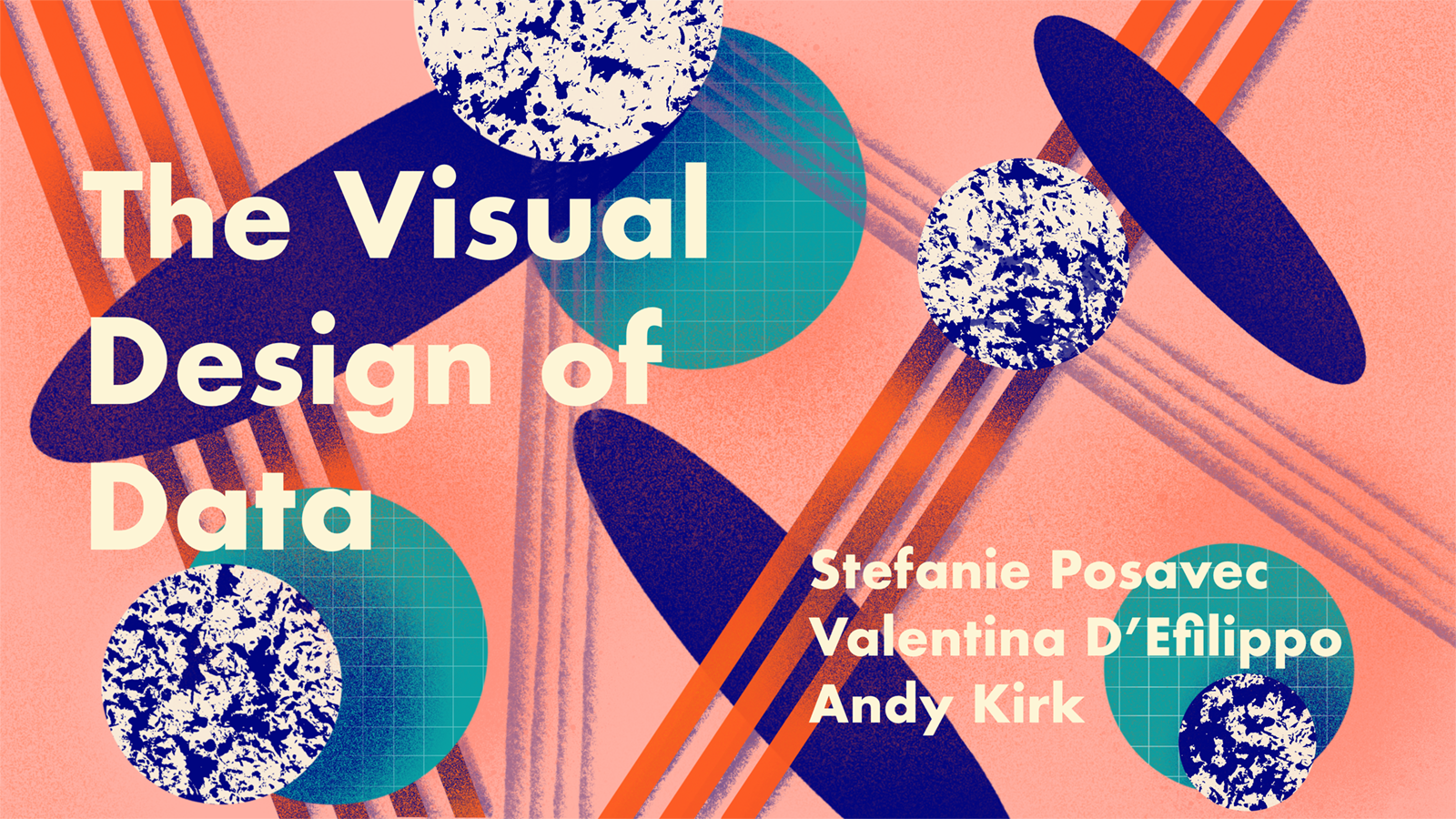
In this training, three world-class data visualisation trainers and designers, work closely together. Stefanie Posavec, Valentina D’Efilippo and Andy Kirk will share their expertise with you during this 16 hour online training. They will help inspire you to understand the principles and practices of designing the visual communication of data. They will challenge your thinking about creating and consuming visualisations. And they will offer you the opportunity to experiment with the design options that you have at hand.
Each trainer will host a 4 hour session where they focus on a specific part of the data visualisation process. In the final session they will give feedback to the participants on the projects they have been working on.
Individual exercise
During the final session the three trainers will guide participants to come up with a data-driven outcome of their choice based on a dataset that is collectively generated. Participants will be asked to answer several questions prior to joining the workshop (i.e. their location, distance they travel to work, level of expertise in dataviz, etc). During the training, participants will be also encouraged to add questions for their fellow participants to enrich the dataset and they will use this spreadsheet to come up with a data visualisation during the final session.
Working on this individual exercise will be primarily done during the fourth and final session. As the training is not a technical course, the aim is not for participants to develop a fully complete and polished data visualisation, but rather to work on conceiving ideas through developing sketches or mockup designs.
Content
Session 1: Andy Kirk
- Introducing the subject, defining & positioning data visualisation in the context of other related activities like infographics, info design, etc.
- Understanding context: who, what, why, where, when and how
- Harnessing curiosity: everything starts with a question
- Working with data: the mechanics of handling and understanding your material
- Editorial thinking: making content decisions
- Charting: a profile of the wide range of contemporary charting conventions
Session 2: Valentina D'Efilippo
- Mapping personal data
- Visual perception (pre-attentive attributes)
- The anatomy of a visual display: layout & hierarchy / color & contrast / icons & visual metaphors / typography & accessibility
Session 3: Stefanie Posavec
- Introduction to rule-based drawing as approach to creating a dataviz
- Drawing exercises to explore offscreen approaches to coming up with dataviz ideas
- The custom data visualisation design process
Session 4: All trainers
- The trainers will give a short presentation to guide participants into the next steps. When participants are working on their project, trainers are available for feedback and questions.
- Presentations of the projects
- Q&A with the trainers
Trainers

Andy Kirk is a UK-based data visualisation specialist: consultant, trainer, author and researcher. He founded the website Visualising Data, where a lot of resources and references can be found. Andy delivers workshops on Information Visualisation and Graphic Literacy all around the world. In 2012, he wrote his first book on data visualisation (Data Visualisation: a successfull design process). In 2016 he released his second book (Data Visualisation: a Handbook for Data Driven Design).
Valentina D’Efilippo (UK) is a award winning graphic designer, author, trainer and speaker with a special interest in information design. After studying industrial design in Italy, she moved to London and gained a post-graduate degree in graphic design at the London College of Communication. Valentina has worked with a number of leading agencies contributing to award-winning campaigns for global brands. In 2013 she published The Infographic History of the World. She recently published her latest book Britannica's Encyclopedia Infographica.
Stefanie Posavec (USA) is a a London-based designer, artist, and author for whom data is her favoured material, with projects ranging from data visualization, book design, and information design to commissioned artworks. Her art practice focuses on non-traditional representations of data derived from language, literature, or scientific topics, often using a hand-crafted, hand-drawn approach.
La communauté autour de turbowins ne cesse de s’agrandir, preuve de la satisfaction générale des utilisateurs. Le système de bonus progressif offre des récompenses de plus en plus généreuses au fil de l’activité du joueur. Les conditions des bonus sont rédigées de manière claire et concise pour éviter toute confusion. Le support multilingue permet aux joueurs de communiquer dans leur langue préférée en toute simplicité. Les applications natives, quand elles sont disponibles, offrent une expérience encore plus fluide que le navigateur. La plateforme offre la possibilité de créer des listes de jeux favoris pour un accès rapide et personnalisé. Les jeux de dice et les options de pari sportif complètent un écosystème de jeu déjà très riche. Les jeux exclusifs développés en partenariat avec la plateforme ne sont disponibles nulle part ailleurs. Les joueurs apprécient la possibilité de tester certains jeux en mode démonstration avant de miser. La constance dans la qualité est probablement le meilleur compliment que l’on puisse faire à cette plateforme.
